Begin with the weekly questions
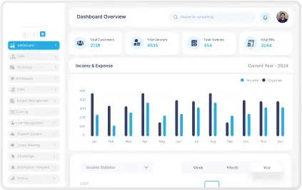
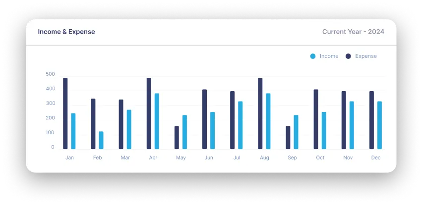
The easiest way to overload a dashboard is to start from the data instead of the decisions. Teams end up with too many charts, no priority, and weak signal-to-noise ratio.
A better starting point is simple: what does the user need to know on Monday morning, what do they need to review daily, and what should trigger action immediately?
- Define user roles before defining widget sets.
- Organize views by frequency of use.
- Surface exceptions faster than background trends.
Defaults matter more than options
People rarely configure dashboards as much as product teams imagine. Most users land, scan, and move on. That means default sorting, default date ranges, and default summaries carry more weight than a long list of controls.
If the first screen cannot answer the most important question, the dashboard will be treated as clutter even if the underlying data is valuable.
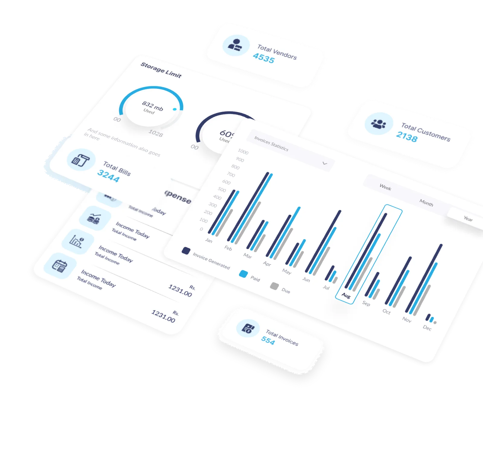
- Use one clear primary view per role.
- Reserve advanced filters for deeper workflows.
- Show next actions near the data, not in separate menus.
Adoption is the real KPI
A dashboard is only successful when people trust it and return to it. That trust comes from accuracy, clarity, and consistency between what users see and what the business actually acts on.
If the team still exports everything to spreadsheets, the interface did not solve the decision problem. That is the signal to reduce clutter and rebuild the experience around real usage patterns.
- Measure repeat visits and time to insight.
- Check which widgets are ignored across roles.
- Refine the layout using observed behavior, not assumptions.